Thursday, July 30, 2015

AppSMART 2015 @ Colombo August 8th - Apply Now!

අගෝස්තු 08 ලෝක යොවුන් දින
Be the Force - Drive the Future
Invitation to ICT - Tech - Media & Design Students


Smart Mobile Technology For Youth


On 8th August, World Youth Day

@ Dialog Axiata Head office Auditorium, Colombo 

More Information  |  Apply Here


oie_transparent-21.pngsayura.pngs1.pngayv.jpgda_logo.jpg

Saturday, July 25, 2015

Apply for AppSMART 2015


AppSMART 2015 @ Colombo

Smart Mobile Technology For Youth


On 8th August, World Youth Day

@ Dialog Axiata Head office Auditorium, Colombo

More Information  |  Apply Here

SHILPA SAYURA DIGITAL ACADEMY
Learning on the Cloud

Thursday, July 23, 2015

How to redirect your website to its mobile version


Javascript window.location Method

Mobile phones typically have a small screen width. A simple trick is to redirect if the browser width less than or equal to 800 pixels. However when the mobile is horizontal the with can be increased 960 pixels or more. The tabs use larger with will still use the non mobile site.

Place this in the head section of your main website code.

<script type="text/javascript">
  <!--
  if (screen.width <= 800) {
    window.location = "http://m.shilpasayura.com";
  }
  //-->
</script>
To get the best results, test it with various smart phones.

.htaccess URL rewrite redirects

Based on the MIME types browser support,  .htaccess can redirect visitors

RewriteEngine On
# Check for mime types commonly accepted by mobile devices
RewriteCond %{HTTP_ACCEPT} "text\/vnd\.wap\.wml|application\/vnd\.wap\.xhtml\+xml" [NC]
RewriteCond %{REQUEST_URI} ^/$
RewriteRule ^ http://m.domain.com%{REQUEST_URI} [R,L]

This can check wap capability for wap apps which are no longer needed with smart phones

CSS3 media queries

Currently this is the best option as you can use different style sheets to render your web site on any device.

<!-- CSS media query on a link element -->

<link rel="stylesheet" media="(max-width: 800px)" href="device800.css" />

<!-- CSS media query within a stylesheet -->
<style>
@media (max-width: 600px) {
  .shilpa_sidebar {  
  display: none;
  }
}
</style> 

A good method is to seperate general and device specific css into seperate css scafolds.

<style>
/*General CSS here*/
font-family:Arial, "Sans-Serief";
</style>


<style>
@media (max-width: 1300px) {
font-size:16px;
  }
</style> 

<style>
@media (max-width: 540px) {
font-size:12px;
  }
</style> 

More advanced information on this
https://developer.mozilla.org/en/docs/Web/Guide/CSS/Media_queries
Saturday, July 18, 2015

Forwarding Ports in a Broadband Router


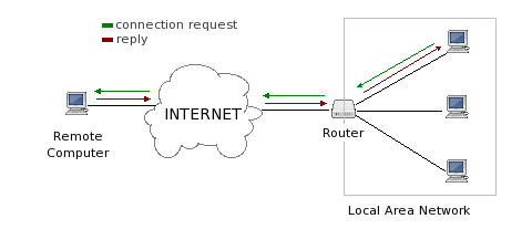
Broadband routers keep track of all outgoing connections from the LAN side by maintaining an internal mapping table of which computer on the LAN is responsible for a given outgoing connection to a particular destination on the internet.  This allows two-way communication between computers on your LAN and computers on the internet.


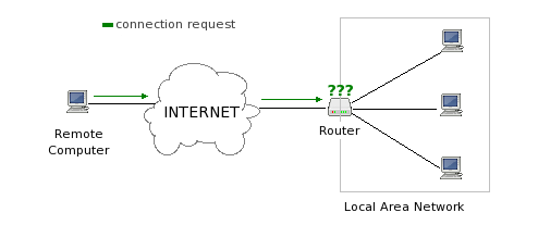
When an unsolicited connection comes in from the internet, your router does not know what computer, if any, in the LAN should receive the connection, and will block it.


In order to receive incoming connections from the internet to your computer on the LAN side of the router, you need to change a setting in the router's configuration so that it forwards all incoming connections for a particular port number to your computer in your LAN.  

Monday, July 13, 2015

AppSMART 2015 : on 8th August Word Youth Day


Function appSMART 2015{
1. Welcome to world of Apps
2. What is an app? and how does it help society & business
3. Design a Smart app of your own Idea 
4. Trending Tools for Mobile App Development
5. Education Apps in Local Language
6. Where to go from here
}
Come! Create your own app

8th August in Colombo
Apply Online